Thursday, 25 April 2013

Evaluation Question Seven

Looking back at your preliminary task, what do you feel you have learnt in the progression from that to your full product?

Looking back at my preliminary task, I realise that the difference in skill level is vast. I have learnt a lot about how magazines are produced and especially in what features I need in order to make them look professional. I changed the outlook from my preliminary task to my final product loads; especially with the theme of my retro originality, and use of colour palette and fonts.

When analysing different types of magazines, I realised that probably one of the most important elements was the cover model. Looking back at the front cover of my preliminary task, I realise that the cover model didn't display much emotion or convey anything in particular that was relevant to the magazine I was selling for the college. After researching many different genres of magazines, I have come to realise that differing emotion, such as the hint of sexuality or a mysterious persona, that is portrayed through the cover model can have a major impact on how your magazine is viewed by its consumers.
I know that they were both of myself, but my preliminary task image gave off a very plain student vibe (and I didn't even link it in to a headline on the cover). Whereas on my final product, I hoped to give off the potential vibes of a carefree attitude, with edge appealing to both genders. Also, through changing the colour scheme to black and white thanks to the editing tools in Adobe Photoshop, with my main popping colour of red, I was able to create a look of individualism, with a hint of sophistication, but which obviously wasn't too feminine. I changed the costumes too; my green jumper gave off a calm and collected persona in my preliminary task, but the denim jacket in my final product gave off a edgy rock-chic vibe.
Plus, with the ability to change the effects and colour of the image, it can further represent what type of genre and style your magazine is centered towards. For my preliminary task, my ability to edit and change the look of my images was very limited, because I was using the software, Microsoft Publisher. This was very basic; I could barely cut out the background of my image for the front cover, leaving an awfully non-relevant colour behind. At this point, I used this software because I had no idea on how to use Photoshop, which I now know has a far better range of editing equipment for its consumers to interact with.
The development of my technological use has become a lot more advanced and definitely changed throughout my course. I now know how to grasp a lot of the elements of Photoshop, as well as editing images and texts so that they are relevant to what is being advertised in the task set.
For example, in my preliminary task, I used the most basic of fonts for even my masthead and main sell lines on my front cover; which I now know wouldn't have appealed to a larger audience around the college. It was far too simple, and even the colour scheme at times was too harsh on the eye which I realised wouldn't attract many people because it seemed too tacky. When comparing it to my music magazine's front cover, I can tell the difference straight away. The mastheads are immensely different; my music magazine one is bold and in the middle of the page, with a red outline, accentuating the style I was aiming to give off. I was only able to obtain this text through realising that this software allowed its consumers to download their own fonts so that they could be used in their product. This really helped me along with the process of making my magazine look as professional as it could be with my recent skills acquired of Photoshop.


When I compare both my contents pages from both tasks, I can tell that my skill level has improved a lot, partly due to analysis from realistic magazines, and realising which features are important within them; these elements can range from the all-important feature of your cover model's story, to adding perhaps an editor's note at the top of the page.
First of all, the layout and composition of my final product is a whole lot more professional than that of my preliminary task. In the latter, my choice of colours was minimal, but at the same time, they were really basic and unprofessional because of their boldness, contrasting with the basic fonts. Plus, the preliminary task was pretty much 'cut' into four parts; contents, image, text and a small review. After researching real contents pages, I realise that the quality of mine, plus the relevance and layout was very poor. I didn't know how to construct a contents page properly because of my limited knowledge anyway, plus that current software was far too basic.
So, looking at my music magazine's contents page, I know that I have added pretty much all of the needed aspects of a real one into it; and the outcome is professional, especially the layout. This is due to the fact that everything is spaced out equally, and I knew where to place certain elements of the magazine depending on its importance.


I have realised that through Photoshop, I can create a realistic magazine because of the countless editing tools which are available, unlike on Microsoft Publisher, where I could only really rotate images and maybe take the background out of them.
I've also changed the general contents feature, into something far more exciting to read with the colour palettes and the different tones due to the editing effects. It stands out a lot more than my preliminary contents feature because of this, and especially through adding in quirky fonts like Lemondrop.
On a whole, I feel like I have improved dramatically. Through using relevant sources, like real magazines, peer feedback, Photoshop and coming to terms with how a magazine is put together, I feel as though my final product reflects my step up from my preliminary task loads.

Evaluation Question Six

What have you learnt about technologies from the process of constructing this product?

Looking back on the start of the year, my knowledge with important technologies to produce my magazine was very limited. I knew how to use my DSLR properly though to take decent images for my magazine, using my Nikon D3000, with 10 megapixels (which may not seem like loads these days but the quality was at a high standard for my product). Another aspect which I already knew was how to edit these photos when uploaded to a computer or MAC; so this really came in handy, especially if I wanted an image in black and white changed from colour.


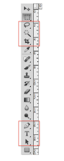
But with the likes of Adobe Photoshop, my knowledge was awful. To be quite honest, I wasn't confident at all in thinking what my product would look like in its final stages because of how limited my skill level was. Within this software, tools such as the 'Magic Wand Tool' and the 'Lasso Tool' helped me to edit my images on the different pages to a very high standard; they looked professionally done when I erased the background, and I was even able to use the 'Brightness' and 'Contrast' tools to change the colours of the images and the depth. Another element which I grasped was 'Layering'; at first I didn't have a clue on how it worked, but after help and a lot of time experimenting with moving the different 'layers' around so that the images and text could be either in front or behind one another, I was able to make the elements of a suitable music magazine look professional and to a good standard that looks realistic. Another one would be the ability to download different texts into the numerous different fonts that come with Photoshop; this really helped me to choose from a range of fonts that were suitable for the style of my magazine, like "TEAM SPIRIT' and 'LEMON DROP'... With many hours of building up these skills gradually, and finally coming to grips with this software, I felt as though my final product really reflects on how far I have advanced, and although my skill level even now isn't the best, my opinion on building my knowledge is positive wholly.


Furthermore, with evaluating my magazine I learnt how to use the likes of www.animoto.com, to produce professional-looking videos that were suitable in presenting a different form of media apart from the standard www.blogger.com, which helped me to make my blog look professional however and make my media knowledge expand further with different elements. I would say that Blogger was the easiest aspect to grasp; it's simple and straightforward to use, and let me add links and photographs to my posts, expanding on the content of them. It gave me far more freedom than the standard essay; it let me delve into my creative side and even change the backdrop for my blog, and add my own personal twist towards it.

On a whole, I feel as though I have really learnt the most on Adobe Photoshop. Like I said, my knowledge was very limited, but after time I really got the hang of using the software. It helped me to edit photos in a way that I have never known before; unlike Microsoft Publisher which I used to create my preliminary task. Although at first, I couldn't come to terms with layering on Photoshop, after a while, I learnt that they were really important for editing/hiding/deleting certain aspects in all three of my magazine pages.

Evaluation Question Five

How did you attract/address your audience?


Featured 'model' and 'artist'

Obviously, I chose myself for my main artist because I found it would be far more simple than having to ask around my friends for a time-consuming task of photographing them. I feel as though I have attracted my audience through the somewhat carefree attitude I have presented, especially on my front cover. My expression isn't too girly; I'm barely smiling, which indicates that the tone of my magazine is quite serious; it appeals to both genders through the sense of carefree attitude. Although it is suggestive that my magazine is still rather laid-back, especially when the audience go to the DPS and find that I'm smiling proudly with the music editor, Robyn Green. This gives off a sense that I take this artist takes their music seriously, but they can still be confident and have a laugh with others, signifying they aren't snobbish because of their position in the music industry, further giving my magazine a sense of a welcoming attitude.


Competitions and Reviews

Through the additional features including reviews in my magazine, I feel as though this would attract my audience because of the relevance to people's interests. Obviously, people do sometimes buy a new album with hesitation, even if they're really fond of the artist, so through adding reviews into my contents page it should help to deliver a sense of help towards my audience. For example, I have taken Ellie Goulding's second album, Halcyon, which is definitely a change from her debut, therefore her fans may want to know what this change involves.
I have also added two competitions, both very different in genre, but this again appeals to a wide variety of audiences. I have made sure that my audience would be familiar with these artists, especially with Katy Perry who I have said will be performing live in Paris. This should heighten the competition's achievement because of the location in which the artist is playing; Paris is one of the most popular and cultured cities in the world, and everyone is familiar with it. On a whole, competitions make the magazine seem more welcome with its audience, and it should draw them in closer to reading it.


Additional, Familiar Artists

The artists featured are all on my iPod (bar the fictional of course), representing that my music taste is diverse. But I have chosen familiar artists for my audience, and placed those on the front cover to attract them further with how popular and/or individual these artists are of today. Furthermore, to mix with the differentiating genres, I have added some unfamiliar artists here as well, like Framing Hanley and Wheatus. This helps towards the idea that my magazine promotes smaller bands who are still making their way up in the music industry; the magazine doesn't just feature well-known artists.


Evaluation Question Four

Who would be the audience for your media product?


Clicking on the above link should take you to my Animoto video of my fourth evaluation question, explaining the suitability, age range etc...


Age: 18

One of my friends, Andy Armour, may read Lights because of the simplicity of the composition and colour palette, as well as the variety of artists featured within my magazine too. I know that Andy likes rather heavy music, but he also likes bands such as Paramore with female vocalists, so Ellie Rose from The Small Things may appeal to him because of the similarities within these two bands.

Wednesday, 24 April 2013

Evaluation Question Three

What kind of media institute might distribute your product and why?


Clicking on the above link should take you to an Animoto video which I have created to show, through a different form of media, the publishers and ways of distribution which could be used for my magazine.

IPC Media has been chosen as one of my media institutions because, after researching their company, I realised that they were the publishers of NME; this particular magazine has been one of my most important inspirations. They also publish many women's magazines too, like the famous fashion-weekly, LOOK magazine. So it's definitely suggestive that my own magazine could be published by this certain institution.

The second media institution that could possibly publish my magazine would be BAUER Media. They publish the very popular music magazines, Kerrang! and Q. These two magazines as well have been some of my most important inspirations throughout the construction of my own music magazine; therefore I find that this particular company could possibly publish mine because of the appeal to a good variety of audiences as well as the ability for both genders to be interested in such as well.
This is partly due to the fact that they publish both men and women magazines, such as Closer and Grazia, plus for men they're the publishers of Kerrang! (A usually more dominating male-themed magazine because of the music genres featured plus the colour palettes).

Evaluation Question Two

How does your media product represent particular social groups?


I've been inspired by Q and NME mostly with my magazine's outcome, especially with their colour palettes and the variety of artists featured within the magazines. What I am concentrating on here however, is the artist featured on my magazine's front cover. The differences of Cheryl Cole and Florence Welch are rather contrasting; one is a mainstream pop artist whereas the other delivers a powerful voice mixed with upbeat drums and alternative music. I have chosen Q as one of my inspirations due to this difference in which they always seem to give off to their audience in each issue. Although their poses are somewhat seductive, and my own in my magazine is laid-back and carefree, I still took on the idea of having a powerful image that should help to sell my magazine. My own image represents cool, carefree stances, that appeal to both genders through the powerful  pose of looking not too bothered, and at the same time, making eye contact directly at the audience brings in the portrayal of importance.


The poses shown tend to give off a hint of sexual feminism and power, representing a dominating and sensual womanly figure in the media. Their costumes and facial expressions deliver such aspects; they want to appear demeaning and mysterious. Q are inspirational for difference, so I've tried to take on the look of mystery too with my pose being a little carefree and barely showing a smile. Overall, my aim was to attract an audience who aren't girly; they have an edge, a difference and they like a variety of things; they don't live up to the media's 'perfect' expectations and they like being original in their style.

Evaluation Question One

In what way does your media product use, develop or challenge forms and conventions of real media products?


Masthead

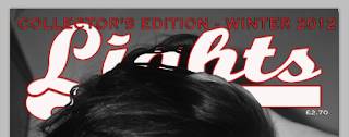
First of all, I want to point out the masthead of my magazine. The title is 'Lights' for a reason; I felt as though the idea of artists' 'names in lights' was a great appeal towards the genre of my magazine. Taking concerts as an example; before you go into the venue, the artist's name is usually always mounted above the entrance in lights, with simple lettering, appealing to the audience below. To my audience, this will be a common aspect; they probably go to concerts regularly and will understand why I have named my magazine, Lights. Furthermore, the font which I used appealed to the original, retro theme of my magazine; through adding a deep-red outline against the white text, it contrasted against the grey background, enhancing my audience's senses in wanting to look at my magazine more. The masthead is in the centre, making it look important and professional, like Kerrang's masthead or Look magazine.

Style and Composition

The style is pretty obvious in my magazine; retro and rather quirky simplicity. Minimalism is a strong aspect of my magazine because it somewhat appeals to both genders, plus it gives off a professional outlook. Taking the fonts which I have used for starters, are very important as part of the outcome, as they contrast with the basic pop of red tones and monochrome colours which I have used throughout. The font for the masthead was taken from the website, 'Da Font', which allowed me to browse numerous themed fonts that would be suitable. I chose the theme, 'retro' and found 'Team Spirit'. I really liked how it was relevant to that of Slam Dunk festival's font, and the simplicity really caught my attention. Furthermore, for my 'Original Rock, Original Roll' title on my DPS, I used the font, 'Lemondrop', also found from the retro theme on 'Da Font'. On a whole, I found that the font generally was a very important aspect of my magazine; it added further emphasis on the composition and features included.
The composition is very basic, but that gives it a hint of added professionalism. It's apparent that throughout my magazine pages, I have tried to make the features stand apart from one another with enough space, and to not have sell lines for example, being over-crowded and difficult to read. This is important when attaining a smart look for my audience.

Styling and People

Obviously my main artist featured is myself, as I found it a lot easier to take a photograph of myself with my SLR and self-timer, than having to arrange a meeting with one of my friends to use a photograph of them, which can prove time-consuming and they may not even feel comfortable in doing so. Looking back at my costume ideas, I have stuck to these thoughts with the use of wearing a denim jacket on my front cover, and a checkered shirt on my contents and DPS pages. This hopefully lends to the overall simplicity, and general relaxed vibes that my magazine gives to the audience; I didn't want the model to be dressed up for a night out, with a short dress on for example or her hair done neatly. As you can see, I've delivered a pose which is neutral, but adds effect through the way I am holding my hair; giving off a relaxed, carefree persona.

Overall Genre

To people who weren't fans of my magazine, defining the genre may prove a little challenging. I have 'Ellie Rose' as a somewhat punk-pop, rock-vibe artist, whereas Ellie Goulding is featured in my magazine who is known for her electro-pop vibes with a bit of added guitar. My overall genre appeals to most people these days; I know for myself that tonnes of people won't stick to one genre in the music industry. They'll have genres probably ranging from drum and bass to a mix of rap and metal. My genre is equal to most people's music tastes; I have added difference in my theme therefore the genres will accustom to the vibes of music that's featured. I have nothing featured however, on totally generic boy-bands or artists who have some talent but are still overly famous because their music is mainstream. I didn't want that; the style of my music in the magazine varies, but they all have their own personas in the music industry, and I wanted to hint at my audience that difference is key.

Monday, 25 March 2013

Finished DPS


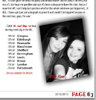
This is the final outcome of my magazine's DPS, which overall, I am rather pleased with. Taking NME's and Q's DPS's into consideration, I decided that the short story idea was a whole lot more professional than a standard interview. Plus, from receiving critical feedback that my interview was too short, this really brought on the idea of making it a lot longer and interesting.
In my opinion, it ties in with the theme of the overall magazine, using monochrome and red colours. The other additions to my DPS were firstly, the small borders across the bottom so it made it look more individual and spaced out properly. I added an enlarged quote on the top of the main image so it brought the image together without having too much black and white space.
I also added tour dates near the image of the vocalist and the music editor [myself and my friend, Robyn]. This was to join in with the ending of the interview, "see you on the tour, guys". It made sense to tie it all together.

Thursday, 21 March 2013

NME and Q's Professional DPS's (Further Inspiration)


After researching the fashion magazine, Company, for further inspiration on my DPS, I decided to look at NME's and Q's as well. As you can see, the difference from Kerrang's isn't phenomenal, but what these magazines do is make the interviews look even more professional through the use of creating a short story from them. Although it may seem like a lot to read, I find that through adding small elements of what happened on the day of the interview, as well as talking about the actions of the artist make the interview seem all the more intimate, and this is really inspiring for my original theme.


Further Additions (DPS)


The further additions which I have added to my DPS are firstly, the colour change of the word, 'Roll'. Because I have added a black and white image of the 'singer' in my interview (the sunset images didn't look right and professional enough) the black lettering was too dark to read properly, so I kept to my original colour scheme and made it white with the red outline still there.
I have also added black boxes to the questions from Robyn in my interview. But I'm not very pleased with how they have turned out; they seem misplaced and very boring. I duplicated them all on Photoshop so they were mostly all the same size, but even with that, I am really not satisfied with the outcome of them.
The other small additions are the three lines across the bottom where it marks which page the reader is on, and the fact it's a collector's edition. I thought this would be good as it made them seem as though they weren't mixed within the interview.


Inspirational Background Images (DPS)


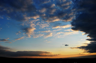
The images here I've taken at sunset, I thought, were inspirational and I might use them as part of a photo on my DPS. Because I have edited them so they're rather 'mysterious' with the dark casting, it tended to fit in well with my colour scheme, and the blues and oranges of the sky give off a contrasting appeal. Along with this, I would intend to place a photoshopped image of myself over this background, preferably on a landscape so my body too is in the frame.

Wednesday, 20 March 2013

Company Magazine DPS Inspiration

Company Mag DPS Inso

I've created a video on Animoto to show a different side of the media, and it explains what Company fashion magazine have inspired me with. The music isn't relevant to my coursework; it was just added for effect automatically.

Thursday, 14 March 2013

Third Draft of DPS


I decided it would be a good idea to add a photo of my music editor, so I have used one of my friend, Robyn, where she's wearing a Guns N Roses t-shirt which ties in with my magazine, and her facial expression gives off the idea that my magazine is edgy and quirky.
I have also changed the font of my subheading to a more laid-back style, but used the consistent font of 'Omnibus' for both names to make them stand out. I have also added a 'handwriting' font to make it look as if the music editor's signature is near her photo.

Second Draft of DPS


I really feel as though my DPS is coming together; I have kept the page numbers and collector's edition theme consistent on the bottom, and with the simplistic colour scheme, I decided to make 'Robyn' and 'Ellie' in a deep red because it stood out further.
I have also made the interview parts where Ellie speaks, one font size bigger than of Robyn's, to make it subliminally stand out a tiny bit more. I have also changed the layout of my interview, so the white space could be filled with images or enlarged important quotes from the singer.
I added 'Original Rock, Original Roll' as part of my title for the DPS, as it tied in well with the overall theme of the magazine. I know that I have a range of artists featured in my magazine, but this particular one had a sub-heading of 'ROCK STAR STATUS', therefore I thought it would be appealing to have something similar in the title of the singer's interview.
For now, I have added the sub-heading 'Music Editor, Robyn, meets her idol, Ellie Rose...' I found that this was a good way of tying in both the editor and the singer; it makes it seem more realistic that this vocalist could possibly be the idol of people across the globe.

Basic Interview Start


I decided that the title didn't fit with the theme I wanted to give off to my audience; I wanted something with more edge and class, so I deleted that. Here I have the basic layout of my interview with 'Ellie Rose'.

Kerrang's Inspirational DPS's


I know that I want an interview in my DPS, therefore I thought it was helpful to research Kerrang's own DPS's, as they usually have a consistent theme of the artist speaking to the interviewer, and vice versa, as you can see in the above issues. The theme as well, of these, may be not what I am looking for because of my retro theme, but the way in which the interview is laid out is very appealing as the structure is professional, and set out individually.


First Draft of DPS


To begin with my DPS, I decided to use the colours red, black and white so the theme is consistent throughout all of the pages. I added the title 'Success has never been so sweet' because I felt that the added alliteration made it sound ever more catchy. Through editing the font to Lemondrop and adding a shadow against it, the bubbly, retro theme came forward even more. I added a ruler to 'slice' through the middle of my screen so I knew where the crease would be in a genuine magazine.
Usually, at the beginning of a magazine, or even a novel for example, the first letter of the introductory paragraph is bold and big, it captures the reader's attention. I decided to use the same font, Lemondrop, for the 'T' to make it seem quirky and professional.
I added page numbers to the bottom too to make it seem more like a realistic magazine, added 'Collector's Edition' to remind the reader of the magazine's importance, and added a 'News' feature in the top right-hand corner so the theme of the DPS stood out further.

Thursday, 7 March 2013

One Further Correction on Front Cover


I received some critical feedback on the layout of my individual sell-lines on my front cover, saying that I should perhaps make them more spaced out, but still look all the same. So I done exactly that without changing the outlook too much, but I also added a smaller subheading below the band 'Foo Fighters'. I thought that this would be a good idea as one more tends to bring it all together, and uses the space that was just blank and doing nothing; I think it's better presented now.

As this is my finished front cover, I really feel as though my target audience should appeal to my magazine generally. It should catch their eye; maybe because of the simple yet original colour palette which I have used.
Remembering that my target audience is aimed at older teenagers to around people in their early thirties, I really feel as though this magazine cover has captured the feel of different artists and style in the music industry. I am aware that my artists featured here are different from one another; Linkin Park are usually deemed as nu-metal or rock, whereas Lana Del Rey has a unique and haunting voice, tying in with her vintage look... Then the fictional band, The Small Things, which I have created along with Ellie Rose herself are, in my opinion, a rather punk-rock type of artist. So on a whole, it may seem as though my genre of magazine is confusing to my target audience, yet I really do feel as though they would be capable of understanding that I wanted to create a magazine with difference and unique style. The artists which I have included all possess this; although some may be seen as mainstream, they're not generically made bands and solo artists in which have become famous overnight.

Double Page Spread Plan and Rationale


This is the briefest plan that I have done for my magazine, but I feel as though the depth wasn't needed as I know I'll be changing the DPS throughout its development. I have made sure however, that each 'page' is sectioned off, and I have drawn out where I would like particular aspects of the DPS to be placed. As I progress with this current part of my magazine, I will probably change a lot on the current layout, but as of now this is a good guidance.
I have tried to make the text boxes look spaced out and around the same sizes for a professional, more realistic magazine outcome. In magazines, I would usually see the text boxes aligned with one another, so I have tried to keep this theme consistent even though this is only my planning.
It could be suggested that I have placed far too many boxes of text on the DPS, but as said, this is my guidance and from here, I shall look at other real DPS layouts from particular magazines that suit my own genre, and grasp more ideas on how to make this particular element of my magazine look professional and clearly tied in with what I want to achieve.


Thursday, 28 February 2013

Finished Contents Page (?)


After making further minor corrections on my contents page, I find that it looks rather complete and to a good standard; I have kept the same colour scheme from the front cover; mostly reds and monochrome colours for an original, authentically retro appeal. The only other colour really that stands out is the light blue box; but I needed a different colour for this particular aspect because it makes the contents page look far more appealing and not bland.

The corrections which I have made are mostly on the collector's competitions part... I decided to add in an image that I took from a gig in 2010 of Linkin Park's frontman, Chester Bennington. I chose this because I found that it 'merged' the two competitions together (considering I had my image of both Katy Perry and an image I took of Paris in 2010 behind her as well).

I tried to keep the writing simple and minimalistic because I am trying to make it look like a contents page as much as I can possibly do so. So, catchy slogans instead of lengthy paragraphs is far more effective on this page and I have stuck to this method of appeal.

Previously, I said that the font was a different size, but I realised I had two different fonts entirely, so I found the correct font - "Omnibus" which has a retro theme - and made sure that all of the artist had this style and size.


Time Management

From today, I am aware that there's only THREE weeks left until I have to complete all of my magazine pages. So far, I find that I am on task; I (think) that both my contents page and my front cover of my magazine are completed, but I intend to get peer assessment from others in my class just to be sure that they both have a professional outcome. For now, I have started my double page spread, but haven't got a draft for such just yet. In the oncoming weeks, I plan to have this completed and done to a high standard of work.

My plan until the deadline is to mainly focus on my double page spread; I need to collect images and think of a great 'interview' or story about this fictional artist for my magazine. Other than this, I should concentrate on making my blog full of posts that continue to show my progress. I think that, so far, my blog is up to date, but I need to expand on how I present my media elements; perhaps videos and podcasts would be better than the usual print-screens and JPEG images...

Thursday, 21 February 2013

Nearly completed Contents Page


From my previous draft of this particular page, I feel as though I have added far better elements that would be apparent in a general music magazine. The main aspect which I have changed is the "10th Collector's Edition" to "Collector's Competition"... When analysing realistic contents pages of magazines, there usually is always a part in which a competition is featured, however big or small it is. I thought that, because this is a collector's issue, I would make the competitions of importance and use well-known artists from across the globe....
So for this part, I have used the band, Linkin Park, and the pop-artist, Katy Perry. I am aware that these artists are extremely different in their music genres; but I wanted to create a magazine that appealed to many audiences of around teenage years to late 20's. When you see music magazines, they're all mostly adapted to the pop genre on its own, or heavy rock... I wanted to have a mixture of artists within mine, because like myself, I am sure there's tonnes of people who have a very mixed taste in music of today.
I have realised when analysing this that, in my general contents, the text is the same font but in different sizes; I shall change that promptly and upload a newer version.


Sunday, 17 February 2013

Contents Page Additions

 So far, this is my contents page and it seems to be coming together all the more. I've added print-screens of the additions I have done below.
Firstly, I added - in between the cover shot and the main feature - the issue number of the magazine, the '10th collector's edition' feature as well as who 'photographed' and 'styled' the shoots. These are all fictional but I find that they make the contents page seem further more realistic.
I also added a page number to the main feature of my magazine, so it would be easier for reader's to go directly to that article.
I also filled in the rest of the general contents part, which is mostly filled with real artists but I have also included some fictional ones of my own as well. I am aware that the font size varies; I shall make amends to that but for now this is somewhat like a preview.
Instead of having a 'concerts and competitions' feature, I decided to add something which fitted in with the magazine more, which was further more 'selling' the fact that it is a tenth collector's edition. So for this, I may add in what especially is featured for a collector's issue, what readers can get involved with and perhaps more artist's and competitions that tie in with the theme of this particular magazine.


Front Cover Finish (?)


I decided to add a few more subtitles to my front cover page to make the outlook more like an actual magazine that someone would buy from a shop. For now, I think I am done with this page as I have added all that I want to it, and I've kept the colours and theme minimalistic yet with an original appeal to it. Although there is one side that doesn't have anything added to it, I still think the cover is tied in professionally with the rest of the aspects/elements on the page, such as the masthead, cover model, main sell-line etc...

The three subheadings which I have added all tie in with the headings in the colour white, so I have made the subheadings red to draw in the reader and to create a sense of style. Although they may not be able to be seen properly on Photoshop, I printed out this cover to be able to see if I could understand the wording and I could; meaning if it was a real magazine people would obviously understand the headings when reading it.


Thursday, 14 February 2013

Further Corrections


I find that, as I keep adding more aspects to my contents page, the more it looks professional. In this session, I decided that the 'concerts and competitions' part didn't have a good effect, so I deleted the orange box (I found it really unprofessional) and realised that I perhaps need this part of the page to blend in with my actual contents itself. Above this, I added the section 'names in lights', to make the page even more authentic to the masthead (I chose the name Lights to resemble stardom in the music industry).

On the bottom right-hand side of the page, I decided to add a lightly coloured background to my 'Follow us' section. I chose the colour blue because it fitted in with the rest of the page's colour scheme and wasn't too harsh on the eye, but at the same time it draws in the reader because it stands out. With this, I changed the font so it gave off yet more professional, retro appeal. I also added lines to draw off each individual section of the page, and added shadowing to the photos for a more effective outlook.


Thursday, 31 January 2013

Further Corrections on Contents Page


In this session, I have firstly added an image to the main feature of my contents page, which is the part of the main cover model. This image was taken with my own equipment, and I chose to have the white wall behind so the model stood out, especially with her outfit and the way the hair is blowing. I made the quote from her below stand out from the image, with editing on the outline and colour.
I also changed the background of the competition page to a deep orange, so it really contrasted well with the rest of the page, and added two images together of some of the band, Linkin Park, who are featured within this particular part.
I decided to also change the numbers into a red tone, so they stood out against the jet black of the features in the magazine themselves.

Thursday, 24 January 2013

Simple Outline of Contents Page


For now, this is where I am going to place my features on my contents page. I tested out different areas in which I should place them as such, and this is my outline so far. At the top, I have added the Editor's Note, which is the same as my contents page rationale. I plan to keep the colours minimal, as  this ties in with the theme of my magazine's front cover with its retro twist.

On the bottom, I have created a 'Concerts and Competitions' feature, which probably would be featured in every month of the issue. I have made this tie in with Linkin Park's feature on my front cover, and have used my own images from both a Linkin Park concert as well as a trip to Paris.

I intend to gather more images of the cover model, as on the right, she will be have a rather big feature as she and her band are the main one. I have added a quote for added professionalism and the general feel of it being more like a realistic magazine.

TIME MANAGEMENT

From now, I am aware that my overall product needs to be finished in a few months, hopefully by the end of April. So, with this in mind, I now know how much time I have to do this product, and on a whole, I think that's achievable because I've now began my contents page.

Wednesday, 23 January 2013

Inspirational Contents Pages


Not really knowing where to head with the layout of my contents page, I have researched four similar ones from music magazines, NME, Q and Kerrang. What is most appealing in my opinion, is the fact that there's a huge photograph on them all to hint at the main article/band/artist in the particular issue.
Another element which is most appealing is the editor's note in the top left-hand corner of Kerrang's contents page, with an image of the issue's front cover. I find that this subliminally makes the whole contents page tie in with the front cover; it's obviously meant to be a follow on, and I find that it's a great way of making the whole magazine come together.
I also really like the simplistic order of the main contents on the sides of the issues; their colour palettes are simple, but bold, meaning they stand out and are attractive to read as they aren't too overly powerful.

Contents Page and Rationale


For now, I am going to move on to my contents page, where I have done a rationale featured above. Although there isn't a lot of depth and detail added to this particular rationale, I find that it's because I will gather more ideas along the way when creating this page for my magazine. First of all, I plan to have the Editor's Note in the top right-hand corner of the page, so it seems out of the way from my main features, but at the same time, I shall draw attention to it with an eye-catching word like "Hi!" for example, drawing in the attention of the reader. At this moment, I am drawn between having an editor's photograph in the left-hand corner or simply, like Kerrang, have the front cover of my magazine featured. I shall see which one goes better with my overall layout.

For my main feature in the magazine, which is the fictional rock star, Ellie Rose, featured on my front cover, I plan to make this either in the middle of the page or to the right, depending on which looks more professional and what will draw the reader's attention more thoroughly. To the left-hand side of this, I shall have my main contents area, telling the reader what shall be featured in my magazine. I intend to keep this black, and perhaps make some of the important features bold so they stand out.

I probably won't use the star effects now that I have taken the look of a retro theme for my overall magazine, but I may still use the features, like the competition for my reader's entertainment. The red background stands out against the rest of the page, and I thought that it gave it a finished look of professionalism without looking too over the top, and keeping the same colour scheme as my front cover.

Lastly, I still really like the idea of having a film-reel of three photographs for my magazine, as this again, ties in with the vintage feel I want to portray, so the Polaroid effect should give off a great similarity. On the bottom right-hand side too, I have added where my magazine can be located on the three most popular social networks of today; Facebook, Twitter and Instagram, and I have came up with a fictional 'go-to' site for each.


Thursday, 17 January 2013

Further Inspiration


The famous Rolling Stone magazine covers have always caught my eye, purely because there are minimal aspects that are featured, in the magazine, shown, which gives it a simplistic and original look. As you can see, I've print-screened both the famous version of Adele featured, near my own magazine cover. This particular magazine cover really inspired me to create something quite similar, but obviously intended for my audience and with my own personal taste included.

It's obvious that both covers have very similar aspects; this cover was my main inspiration after all. I also realised that the left-hand side of the cover has been left blank, which - for now perhaps - I have decided to use as well, as I found that it gave the magazine a fresh and professional look, without looking too overloaded with features.

Thursday, 10 January 2013

Corrections on Front Cover


Taking my peer assessment from the class, I have  firstly made the masthead a lot bigger so it fits the whole width of the page, and through this I find that it looks a lot more like a professional-looking front cover. I haven't changed any font or colour however; I plan to keep this retro theme. Secondly, I moved the price of the magazine to just below the masthead, as in most magazines they are usually subtle, so I wanted that same effect, and with this it wouldn't draw attention from the rest of the magazine features. For the 'Collector's Edition' part, I moved it above the masthead, and kept the colour standing out against the latter, and made the font a lot bigger so the reader would know that this particular edition of my magazine is one to keep.


For one of my headlines, I decided to change most of the band names which I added on to the right-hand side of my magazine, and swap them over to the left-hand side instead. I done so because this particular headline  needed quite a lot of space, and with adding the names of the bands featured within my magazine just over the cover model's hand and a small part of her face, I haven't hidden any features of herself and I have made this aspect of the cover stand out as much as possible. I done this by adding the font, 'Copperplate' from dafont.com and with using two relevant colours of red and white, I was able to create a significant theme which ties in with my overall colour scheme. Plus, I made sure that they were all aligned with one another; this made the outcome of the headline more effective and professional.


One of the last changes I made for now, was adding a black outline on the main-sell line. I done so because, beforehand, I thought that it didn't really stand out a lot against the model's jacket, even though the colours were different. By adding the outline, I was able to make the main feature in the magazine look important, and it also draws attention to itself too. Below, I changed the comment to a snappy and short sentence of "Rock Star Status" from my original two sentences. I found that this should draw in the reader even more because it gives the cover model a sense of place and professionalism. Lastly, I moved the barcode to the bottom-left corner and made it a lot smaller, so it wouldn't stand out and look too harsh against everything else featured on the cover.