How did you attract/address your audience?
Featured 'model' and 'artist'
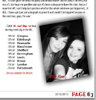
Obviously, I chose myself for my main artist because I found it would be far more simple than having to ask around my friends for a time-consuming task of photographing them. I feel as though I have attracted my audience through the somewhat carefree attitude I have presented, especially on my front cover. My expression isn't too girly; I'm barely smiling, which indicates that the tone of my magazine is quite serious; it appeals to both genders through the sense of carefree attitude. Although it is suggestive that my magazine is still rather laid-back, especially when the audience go to the DPS and find that I'm smiling proudly with the music editor, Robyn Green. This gives off a sense that I take this artist takes their music seriously, but they can still be confident and have a laugh with others, signifying they aren't snobbish because of their position in the music industry, further giving my magazine a sense of a welcoming attitude.
Competitions and Reviews
Through the additional features including reviews in my magazine, I feel as though this would attract my audience because of the relevance to people's interests. Obviously, people do sometimes buy a new album with hesitation, even if they're really fond of the artist, so through adding reviews into my contents page it should help to deliver a sense of help towards my audience. For example, I have taken Ellie Goulding's second album, Halcyon, which is definitely a change from her debut, therefore her fans may want to know what this change involves.
I have also added two competitions, both very different in genre, but this again appeals to a wide variety of audiences. I have made sure that my audience would be familiar with these artists, especially with Katy Perry who I have said will be performing live in Paris. This should heighten the competition's achievement because of the location in which the artist is playing; Paris is one of the most popular and cultured cities in the world, and everyone is familiar with it. On a whole, competitions make the magazine seem more welcome with its audience, and it should draw them in closer to reading it.
Additional, Familiar Artists
The artists featured are all on my iPod (bar the fictional of course), representing that my music taste is diverse. But I have chosen familiar artists for my audience, and placed those on the front cover to attract them further with how popular and/or individual these artists are of today. Furthermore, to mix with the differentiating genres, I have added some unfamiliar artists here as well, like Framing Hanley and Wheatus. This helps towards the idea that my magazine promotes smaller bands who are still making their way up in the music industry; the magazine doesn't just feature well-known artists.


No comments:
Post a Comment