
Thursday, 13 December 2012
Peer Assessment
Target Audience

Name: Jennifer Watson
Age: 19
Jennifer has interests in many different types of music, ranging from metal to retro. I have chosen her as one of my main target audiences because I feel as though she'd be likely to buy my magazine based on the artists featured on the cover. She's a fan of Lana Del Rey for example, and Wheatus. She likes to buy magazines regularly as she's a fan herself of this element of the media, as well as watching science-fiction films in her spare time. I am also aware that she likes socialising with friends - when she isn't revising for exams or doing general college work - who may share the same interest in music or other media, and I know that she's a fan of vintage clothes shops, which ties in with my overall theme of my layout.

Name: Lewis Graham
Age: 18
Lewis isn't the typical sort of male who would go out on a night and spend money on alcohol; he's a hardworking student. Yet he still likes to socialise with friends when he can; at social gatherings at friend's houses or on a typical day out somewhere. I have chosen him as my male target audience because he has a vast interest in music and many different genres. If I were to pick an artist from my magazine in which he likes, I would definitely choose one like Biffy Clyro, as they have this original, sometimes quite heavy genre of music. Lewis is also a fan of 'old' music as well, and I have tried to add artists from the late 90's and so forth. I find that he'd be attracted to the magazine because of the retro appeal; its colour palette is simple attracting both genders, and I have tried to make the text and fonts appeal to male and female by not having biased words and elements within my magazine.
First Draft of Magazine Cover
 This is my first draft of my music magazine cover, and overall I am rather pleased with this outcome so far. I tried to make the draft as professional as possible with my knowledge of Photoshop and other elements, such as the good quality of the cover model image.
I've went for a look of originality; in my opinion the cover looks rather retro and this is the theme which should occur throughout my magazine. With this vintage style, I've made the text similar to that of Slam Dunk Festival's, like I said I may use in my mood board. The colour palette of the cover is basic, yet I think this adds to the more original and 'old' feel about it. The main colour of red has also been tied in with the border of the title as well as the cover model's lips, which gives the magazine a sense of sophistication without looking too over the top with too many colours going on all at once.
In general, I obviously plan to make this cover far better and professional than what it is, so with this, I plan to obtain more knowledge of Photoshop, perhaps test out different images as the cover model and try out different texts and font sizes to perfect it overall.
Friday, 30 November 2012
'Gradient Map' Idea
I wanted to try out different effects on my magazine cover, so for a tester I chose a random photograph of myself and used the tool ‘gradient map’, which let me choose different parts of my image and make those parts black and white. So I decided to make every part of myself like such, whilst leaving the parasol I was holding in my image in colour. I did this by using the magic wand tool as well as the lasso tool so I could select particularly difficult parts with ease. Overall, I definitely was pleased with the outcome and I am sure to use this in my overall magazine draft/finished result.

Front Cover Inspiration and Ideas

Confused with where to head next for my front cover layout, I have researched some modern magazines and logos which have a rather retro appeal throughout their looks. What attracts me most to these is the originality; I know I want my masthead for example to be in a bright red, with a rather simplistic yet old style font. Like the Slam Dunk Festival logo, I was really appealed by the quirky and original style of such; it has given me a lot of inspiration further for the look of my magazine's front cover.
The theme, I want, is definitely old rock and roll, but with a range of different artists. I find that NME and Q have this appeal in their style and layout too; they're minimalistic, but because of their choice of colours, they give off a retro vibe.
The other element which really appealed to me was the fact that most of these magazine covers have their model in a close-up shot, which emphasises their persona, so I find that I may use this in my own magazine layout.
Unwanted Draft of Magazine Cover
After choosing a suitable photograph for my magazine cover, I realised that this image would be suitable as the background had very similar colours which would be easier to edit out. So with doing so, I began to add text as well which tied in with my magazine rationale, and this I chose from dafont.com. The text I chose was something with a retro twist, which I found really blended well with the ‘Slam Dunk Festival’ logo. I downloaded this font into my texts on Photoshop so that I could use this whenever I want. I changed the colour to red so the colour was more applicable to my rationale as well. I done the same with the band’s name, and used the same font for subtle effect.
The last feature I added to this draft was the star icon on the masthead. I edited it to only have a small yellow glow around the outside of such, but I realised that it looked very unprofessional and didn’t really make my magazine look intended for an audience with a passion for rock, punk-pop music genres etc.
Overall, I don’t want to use this image, text or icon for my magazine cover, therefore I will try to find more suitable features that tie in with it even more.

TIME MANAGEMENT
From now, I know that I have to be quick and on task with my ideas; I can't simply mess around with some and then choose a random outcome that I may not like. From here, I am intending to focus fully on what makes a good magazine cover, and look at other images of my own which may come in useful for my final product.
Planning of Magazine Cover
To begin with my magazine cover draft, I used one of the images from my original magazine ones. This one stood out to me at first because it was the most relevant pose in relation to my cover rationale, and the way in which I was looking at the camera resembled ease in my opinion.
So when I began to crop the background from my image on Photoshop, I used the lasso tool as well as the magic wand tool, which I found was very useful when wanting rid of huge and needless chunks in my work. However, after cropping out the background as a starter I realised that I definitely didn't want to use this even for my first draft. The background was very hard to delete therefore the model looked extremely distorted around the edges and very unprofessional. So overall, I plan to use another image for my draft and this has helped me to realise so far that the background needs to be around the same colour for easier editing.


Monday, 12 November 2012


Tuesday, 30 October 2012
Equipment/Consent/Resources
The equipment which I am going to use is first of all, my DSLR; a Nikon D3000 with 10 mega-pixels. I obviously already know how to use this to a pretty good standard, so I can obtain high quality images for my magazine's outcome. The second piece of equipment needed is my laptop, and one of the college's macs for in-college use. The third is my memory stick, so that I can transfer important images, fonts and even my own magazine pages across two different platforms to be edited when possible. When on my laptop, I need editing software, so I'll use Adobe Photoshop to create the best possible outcome for my product.
What I do not need however, is consent from my friends/family, as they aren't going to be on the front cover as I found this would be a time-consuming task and really, they may not even feel comfortable with posing in specific ways.
Costume Ideas

As part of my inspiration with my magazine photographs, I realised that I needed to tie in the outfits which the artist and other people in the magazine would wear, with the genre of my magazine. So going through my own clothing, I came across my own Topshop printed tee with "Music is my religion" quoted by Jimi Hendrix. The shirt is minimalistic; it ties in with my original theme that I want my audience to receive, plus it's not too eye-catching and is a subliminal detail which can cooperate with the artist's own visions on the music industry.
Secondly, I thought that denim shorts and/or a denim jacket would be suitable because they give off rather grungy, rock chic vibes, which at the same time, will attract the male audience because of the simplicity and 'worn' look.
A checker shirt would appeal further with my outfit idea, because it hints at masculinity, but in a way, gives off a laid-back and 'cool' vibe, so I will probably use my dark green H&M one, like the one shown.
Lastly, I wanted one of the people featured in my magazine to wear a band tee which ties in my own genre and style of magazine, so I've chosen a Guns N' Roses shirt as an idea/inspiration.
Front Cover Plan and Rationale

So, beginning with my
planning of my music magazine, I've created the front cover, which in my
opinion has a simple yet contrasting formula of a mixture of colours and
features. First of all, I chose the name of my magazine to be Lights, as I wanted a theme
in music which resembled the stardom of these artists. Although this is a
magazine on music, and having a masthead in relevance to something like the
beat of the music is relevant, it just didn't appeal to me in the way that
'Lights' did. This certain masthead is quirky, yet resembles the energy of
bands in concerts and the general feel of peoples' "names in lights".
The font type which I've used for this is in relation to the one used by 'Slam
Dunk Festival' which I've always been drawn to. The simplicity of it is so
inviting, especially the thick red outline. Another relation to the masthead is
the little beam of light on the right-hand side of it, which I may/may not use;
this was only to see if it would suit the style of my magazine.
Moving on to the cover
model - which I'll intend to be myself as I find that it's a lot easier than
having to ask others for several photographs of them as they may not be
comfortable with doing so - I've made her style look rather punk-like because
that’s the genre which I’ll want her band to be featured in, which I’ve called
“The
Small Things”. Her pose seems really down-to-earth; I didn’t want her
looking seductive or mysterious as I found that these wouldn’t really blend in
well with her portrayal. The camera angle is looking at her straight on and so
far, I want to position it so I can capture not only from her shoulders and
upward, but a lot more as this should tie in with the outfit theme. I don’t
know where I’ll photograph this image so far so I’ve left the background blank.
Her prop consists of a microphone, which I mightn’t use; it was help toward
seeing what would look good and relevant.
In relevance to the
model, she has taken the main-sell line with a solo interview of her “rise
to fame and new album”, along with her band. The text of the band’s
name is the same as the masthead, as I wanted to have an appealing relevance
which subliminally ties the magazine cover together. As you can see, I’ve
mainly stuck to the colours of red, black yellow. So for the borders of this
part, I’ve made them black so they add definition to the text and stand out
from the white background.
On the opposite side
is another sell-line of “Download VS Sonisphere”, which
basically is two festivals with reviews from the magazine and its readers, plus
I’ll include a couple of relevant images on the front of perhaps the artists of
these festivals or festival life. I’ve made these two images have the outline
of beams of light which ties in with the Lights theme.

Tuesday, 23 October 2012
RockSound Magazine Analysis (Inspiration)

To begin with my third magazine analysis, I've chosen
'Rock-Sound'. For starters, I was attracted to this particular front cover for
the sheer fact that the colour is so plain, with tonnes of blue tones used, yet
on a whole it's still professional because each aspect of the magazine stands
out. The masthead is bold and strikes the reader, even if one of the cover models
is covering a part of it. The way in which the colour works for this aspect as
well as the overall theme is through the presentation of different blue hues.
An example would be the contrast between Mark Hoppus' (main cover model,
Blink-182) shirt against the dark blue shadowing of the white main sell-line,
"Blink-182 and Fall Out Boy".
Speaking of these cover models, their poses and
overall mise-en-scene are very laid-back; they barely show any
formal acknowledgement to the camera; they literally stare at it with
slight nonchalance. This could be represented in a negative light,
however, in my opinion; the magazine is far more generally laid-back than the
likes of Kerrang, therefore their stances piece together well for a
professional outlook.
Moving on to the target audience, I’d assume that the
range is from around 13 years of age to around early 30’s. This is because, for
starters, their choice of language is very inviting with how they word magazine
features; they aren’t too harsh with descriptions and the language is suitable for
teenagers and above. I’d say that the age range probably stops at around 30
because that’s the common age for when people stop going to such scenes like
Sonisphere Festival and Download Festival; which mostly typically attract
around 16-21 year olds.
One more aspect which attracted me to this front cover
was the overall layout and design. It’s noticeable that, for the sell-lines
above the main one and on each side of the page, they’re both in a dark red
colour, which subliminally draws the reader into that particular section,
making them want to read both sides. This colour also stands out against the
several blue tones of the cover, breaking up the plain palette and giving it an
edge of contrast to the icy yet inviting appeal. Lastly, with the design, I
love the fact that one of the artist’s featured in that particular magazine is
actually holding the barcode and details of the magazine; I perhaps may include
this quirky, original feature in my own magazine.
 I
particularly like this contents page because, like the front cover, it’s plain
yet very appealing. Yet again, three main colours of red, blue and white have
been used which attracts the reader subliminally; an example is the simple
boxing gloves the models wear; two are blue on either side of the red one shown,
bringing in the whole theme of the page. In relevance to these colours used, it’s
also very clever how, because the red boxing glove is in the centre, they’ve
placed the general contents and features there and used the dark red colour again
to add emphasis against the white.
I
particularly like this contents page because, like the front cover, it’s plain
yet very appealing. Yet again, three main colours of red, blue and white have
been used which attracts the reader subliminally; an example is the simple
boxing gloves the models wear; two are blue on either side of the red one shown,
bringing in the whole theme of the page. In relevance to these colours used, it’s
also very clever how, because the red boxing glove is in the centre, they’ve
placed the general contents and features there and used the dark red colour again
to add emphasis against the white.
Another
aspect which I found rather appealing was the faded editing used on the background
image, making it rather mysteriously invitational. I also found this appealing
through the fact that, although this is most likely the first feature that
people will notice when they turn to this page, it also helps to bring out the
colours used for the general contents as well as defining everything on the page
so that it all stands out against one another.
Lastly, I
like the cover models’ ‘glares’ directly aimed at the camera; they’re giving
off a boyish, witty charm of a ‘fight’, which in a way, could be represented as
a sexual hint of appeal, as they could well be a lot of people’s icons,
especially since they’re known globally. Overall, I was really surprised at
what subtleness and a simple theme can create; the outlook is professional and
clear.
 For the
double page spread of this particular magazine, I chose this one because, in relevance
to the colour palette, the whole background is sky blue, which gives off a real
sense of freedom and youth, and also I like how the tones become increasingly
lighter as it goes down the page. Another professional feel towards this is the
white text, however some could probably critic that this colour used on the
smaller text sort of blends into the background, making it rather hard for
readers’ to understand. However, in my opinion; I believe this has been done
because the band above all wear dark clothes, therefore it could be seen as a
contrast.
For the
double page spread of this particular magazine, I chose this one because, in relevance
to the colour palette, the whole background is sky blue, which gives off a real
sense of freedom and youth, and also I like how the tones become increasingly
lighter as it goes down the page. Another professional feel towards this is the
white text, however some could probably critic that this colour used on the
smaller text sort of blends into the background, making it rather hard for
readers’ to understand. However, in my opinion; I believe this has been done
because the band above all wear dark clothes, therefore it could be seen as a
contrast.
In relevance
to the target audience, the band’s general pose is quite immature yet gives
off, yet again, a sense of freedom which most people in this target audience
feel they should have or already have. I really like how they’ve been
photographed in mid-air like this; it’s appealing and they’re almost able to
jump out the page at the reader in a fun and comical way.
On a whole,
I could say that this spread is quite plain; which it most certainly is.
However I’ve found that through researching this particular magazine its
content and features are pretty basic, yet give off a youthful appeal to its
audience. So, in general, I believe that the theme and style of this magazine professionally
relates to their target audience; they have the needed features and the way in
which they capture and portray them brings them together as an invitational and
youthful magazine.
Inspirational Concert Photographs
I've photographed several bands at concerts, and these are just a few of them. I've chosen to put these on my blog, as they represent music in action; they are strong representations of the energy needed when performing as part of a rock band. This should help towards my inspiration as I could use these in any part of my magazine; on the front cover or in the contents etc. On a whole, I could use these action shots and create some of my own, especially if I choose to make a band as part of my main sell-line.
The two images just below, I took were from a concert on the 5th of November, 2010. I went to see the nu-metal band, Linkin Park, one of my most desired bands in the music industry, which is all down to their quirky instrumental sound with a mixture of rap, drums, piano etc. I like these two images because they represent two of my favourite artist's in the energy of the concert. The right one especially is somewhat blurred, yet it adds to the enticing energy of what I want to portray in my music magazine.


Below are a few more images of what I may want to include in relation to my music magazine and its preparation. The colours of these particular photos, especially the image of a Paramore concert, make the theme of their band all the more vibrant and full of effective energy. The image I took of Zebrahead portrays a punk-like attitude in their movement and attitude on-stage.


Below are a few more images of what I may want to include in relation to my music magazine and its preparation. The colours of these particular photos, especially the image of a Paramore concert, make the theme of their band all the more vibrant and full of effective energy. The image I took of Zebrahead portrays a punk-like attitude in their movement and attitude on-stage.


Saturday, 20 October 2012
Look Magazine Analysis (Inspiration)

Although I
am creating a music magazine, for inspiration I decided to look at my most
desired fashion magazine, Look. I buy this every week, and I absolutely love
the layout and themes the creators choose each time. For this specific front
cover, I really like the colour scheme for starters, mostly pink and white
hues. Although I’m not a huge fan of these colours, the way in which they’ve
been presented on the page gives them a very appealing look for their target
audience, which obviously will be women ranging from around 16 to 50 years old.
Assuming their target audience buy this magazine often, ‘Look’ always have
three blocks of colour, sometimes even the model’s dress sense ties in well
with the palette (as shown). This gives their readers a subliminal message
that, to find this magazine in their store, they will know that they use the
same style each week, constantly varying the colours to keep themselves fresh
and updated.
Firstly, for
me the key aspect which stands out first of all is the masthead and main sell-line.
The masthead is in a contrasting pink tone against the cover model and
light-blue background, giving off a sense of feminism towards the buyer. The
masthead’s font is quite classy, yet plain all the same; this is a great
feature as it doesn’t make the reader squint to read what it says. Secondly,
the main sell-line, “Your Big Beauty Issue” stands out as well, especially the
last two words, and I find that it’s all down to the text size and gleaming
white contrast, giving off a real sense of professional class.
In relevance
to the colour scheme, it’s rather clever how they’ve made it appear as if a
deep pink lipstick has been smeared across the bottom of the page, which ties
in greatly with the fact that it’s a beauty issue. If I wanted to create
something like this for my music magazine, I’d try and find a small aspect of
music, perhaps like an iPod or CD and add this in to a small section of my
cover. The smaller model fashioning “Figure-flattering Outfits” has been
modelled in very invitational and somewhat seductive poses, and I also like the
fact that her outfits stand out against the lipstick background and even the
white text explaining what she’s there for.
Lastly, the
cover model has a ‘super-smile’ pose, showing her teeth. She looks extremely
sophisticated and elegant, two elements which are important at times in this
magazine. Her outfit fits in with the palette used for this issue even if it’s
a different shade of pink. Overall, it could be said that the cover model
symbolises the term “beauty” for this issue, as she seems to give away a
glowing and cheerful nature about herself.
 The contents
page of Look usually always has a white background like this one, which adds a
nice touch of simplicity and style to the theme. In relevance, the text is
usually always black too; a great contrast, which isn’t too harsh on the eyes.
With this colour scheme, I always like how add black background against white
text, as well as black borders, instead of a sudden change in colour, like a
harsh red or yellow. Although there is a dark fuchsia colour, only the numbers
are put in this, adding a sense of simplicity yet again.
The contents
page of Look usually always has a white background like this one, which adds a
nice touch of simplicity and style to the theme. In relevance, the text is
usually always black too; a great contrast, which isn’t too harsh on the eyes.
With this colour scheme, I always like how add black background against white
text, as well as black borders, instead of a sudden change in colour, like a
harsh red or yellow. Although there is a dark fuchsia colour, only the numbers
are put in this, adding a sense of simplicity yet again.
On the
left-hand side is the editor’s note for that specific issue, which has been
sectioned off from the rest of the contents with a beaming photo of her at the
top. She begins with “Hello!” which catches the eye of the reader immediately
as it’s been sized up, and at the same time it’s a message of invitation. The
photograph of her at the top has been given a white background, fitting in with
the background of the page but at the same time, the contrasting purple
background of the image connected to it, defines both images in a very smart
way, especially through the different tones of lighting used for each one.
In relevance
to the images, I really love the idea of making the three photos on the right
look like a strip of photos from a booth. I’d absolutely love to use this idea
in addition to my magazine as I find it very quirky and original. Along with
these images, one rather big image on the left is a great feature of Look, as
it usually gives an indication of what fashionable clothing people would be
able to find in an issue. Overall, the aspects complement each other really
well on this page; they’re professional, original and I’ve really been inspired
to use certain features for my own magazine.
 This
specific double page spread of Look was an interview with the actor, Robert
Pattinson from around 2009, which really leapt out at me because, like Kerrang,
the image of the actor has taken up one whole page. I’m quite sure that I will
want to use this aspect in my magazine; it’s really professional as the entire
interview is kept on one page. The background again, has been kept white to
keep a minimalist appeal, with mostly black and white text, with the one
interview line in the middle a fuchsia colour. The font is the same throughout
which is very appealing as it isn’t difficult to read. The larger text has been
made italic, indicating that it’s part of the actor’s interview.
This
specific double page spread of Look was an interview with the actor, Robert
Pattinson from around 2009, which really leapt out at me because, like Kerrang,
the image of the actor has taken up one whole page. I’m quite sure that I will
want to use this aspect in my magazine; it’s really professional as the entire
interview is kept on one page. The background again, has been kept white to
keep a minimalist appeal, with mostly black and white text, with the one
interview line in the middle a fuchsia colour. The font is the same throughout
which is very appealing as it isn’t difficult to read. The larger text has been
made italic, indicating that it’s part of the actor’s interview.
The actor’s
image on the right is probably very appealing to most women as his look oozes a
masculine aura with his pose yet cheeky hint of seduction with his smile and
look of charismatic charm. This draws in the eye of the reader; this man is
well-known globally and oozes stardom. Although his clothes are rather plain,
this adds to the subtle charm and appealing aura about him to women of mostly
any age in their target audience. The images on the bottom-left of the page are
small yet still stand out from the rest of the page, due to the borders of each
having a subtle grey colour added to them, and in general, still having their
original backgrounds.
Overall, there isn’t a lot of detail going on
with the double page spread, and that’s why I like it. It has so many
minimalist features yet they all go perfectly well together, because of the way
they’ve been structured on the page, along with the basic colour scheme and
style.
Kerrang! Magazine Analysis (Inspiration)

As a starter to my music magazine production, I’ve looked at a few realistic music magazine covers myself to get inspiration in helping me towards the final piece. To begin with, I’ve taken the most relevant magazine that I can think of whose target audience would probably fit well with mine, which is ‘Kerrang!’ Firstly, the content which stands out the most on this specific article cover is the main sell-line; ‘LINKIN PARK’, which is the cover artist’s band. The text used is simple yet very professional, because, for all of the masthead and subheadings below and above, the creators have used the same text and around the same sizes too. The colours are bold, yet aren’t too vibrant, therefore I think that this ties in well with the style that Kerrang aim to give across to their audience. This is because the theme of the magazine is quite masculine, however numerous amounts of teenage girls for example, will want to buy this as well, so in a way it appeals very well to both genders.
In relevance to the importance of both genders, the cover model looks appealing to both men and women. Firstly, this is appealing to the masculine type because of his look; he looks very strong and someone who aims to be the best they can in their industry. His pose is somewhat invitational; he seems ready to leap out of the magazine at the reader, which also could give off a rather manly aura about him as it symbolises stamina and confidence. On the other hand, it could be very appealing to the female gender because the cover model has his shirt off, capturing a somewhat invitational and sexual pose, which exposes him in a confident manner.
Dotted randomly around the sides are smaller features in the magazine, including posters and interviews from bands. Although there is seemingly a lot of aspects featured on this specific cover, the whole look is still very appealing as they are individually spaced out, and arranged in a tidy manner, with contrasting borders and headlines to complement the overall theme. In addition to these headings, relevant images from the artists are included with each one, bringing them altogether on a whole.
Lastly, for the magazine cover, the background of the cover model has been taken away and replaced with a faded lighting effect, which gradually gets bolder as it gets nearer the middle, something which I find would be very appealing for my magazine cover, as it was also an effect I used for my preliminary task piece. This background makes the masthead appear more contrasting, and readers’ are easily able to spot what it says even though the model is standing in front of it.
 Moving on to the contents page of a Kerrang magazine, there are always several images neatly spaced out on the page, usually over five or so images are used from different artists. Whenever I read an issue of this magazine, I am fondly drawn to the contents page as its text companies the images well, and they all have page numbers as well as a few lines written about what to expect from their feature, along with the colours staying consistent with each one.
Also, the contents page title has the same colour scheme as the page numbers and the smaller sub-lines in the contents overview, creating a look of professionalism complementing the magazine and at the same time, making it easier and very suitable for the reader as there aren’t tonnes of colours popping out at them wherever they set their eyes first.
The colour palette could have been extremely dull; yet adding the hit of a bold yellow makes the theme come together perfectly, and adds life in a way to the blacks, greys and whites used on this page. With this in mind, the images also each have their own thin black border, making them stand out by themselves, and in a way, not emerging into one with the white background. Two thin black lines have also been added to section the images as well as the contents overview, so they don’t look squashed together and have a professional appeal.
Overall, I find that Kerrang would be a good magazine to be inspired by; in every issue I’ve read by them, their theme and styles of language as well as colours for example, have always been suitable for their target audience, and have always had a true touch of effort and professionalism put into them, therefore it could be a really good idea to use these as a helpful start when designing my music magazine contents page.
 The double page spreads of Kerrang usually are very exciting to read as they deliver the right use of important aspects in a contrasting manner. This specific spread appealed to me a lot, all down to the overall simplicity. Firstly, the reader will be drawn to the text, “ABSOLUTELY!” as this is the biggest and most eye-catching aspect of the two pages. This text makes you subliminally question what is being talked of; even if you weren’t that struck on the band or artist, it would still draw your attention in further because of the simple colour and text font, which is extremely basic. Bearing in mind of its simplicity, the harsh black background behind that text makes it aim at you directly.
Another thing that really stood out for me was, in addition to colour, the one statement colour; a dark fuchsia, which gave the pages an overall defiant contrast. Another aspect which I found very clever was the cover model and the way that he fit into the background through the editing of his skin colour down a little with contrast so it seemed as well as his shirt being the same colours as mostly everything else. Although this may seem like he doesn’t stand out from the text as well as the background, I think the way he has posed for the shoot has had a very beneficial impact on catching attention. Another feature which I found very appealing was the fact that he takes up one page for himself, and even though he seems laid-back (as he isn’t even looking directly at the camera) this could make him more appealing as a person. It could also help the person to read what’s actually going on, instead of being distracted by his pose that could have been too dominating or masculine for the theme chosen.
The outline of the background creates a contrasting look and brings it all together in my opinion. They could be several camera flashes or even mirror lights, but whatever they symbolise it gives the model a sense of stardom in the industry, and in a way, a sense of importance; he seems to be a well-known person of his genre of music. Lastly, these lights complement the white backgrounds used for the subheadings of each stage in the interview. Subliminally again, it ties in the whole spread, giving it a professional outlook which makes the reader want to find out more on the feature.
Friday, 19 October 2012
Foundation Production Portfolio Proposal
For my AS Media coursework, I've chosen the music magazine task, as I found that I could be a lot more creative with this certain aspect of the media. The style in which I want to go for will be aimed at an audience who have a variety of taste; including perhaps nu-metal, alternative, rock and punk-pop genres - which include solo-artists and bands. So a good example of a music magazine relevant to what I want to create would most likely be ‘Kerrang!’, as this features many different types of these categorical music genres to its audience each week. I intend to be constantly aware of what aspects my genre of magazine are and what should be included; for instance, if the fan-base for this magazine are rather upbeat, like a wide range of music and are mainly all quite young, I need to make sure that the outcome is totally relevant to my audience on a whole. I need to make sure that they would be attracted to the layout, the colour scheme, the headings which I choose; especially the wording as it can't be too industrialised or girly; it has to be suitable for both genders.
I would aspire to have the target audience ranging from around the age of adolescence to early thirties. This is because I find that most people after the latter age won’t be as bothered with buying magazines, and also their taste in music could alter as well. I also find that, most people found at a concert or festival will be in this age range too, especially teenagers and young adults, therefore if I want to talk about these aspects of the industry in my magazine, I will have chosen a suitable audience as they should be the ones who are mostly interested in this magazine on a whole.
As I delve further into my research, I will intend to look at the basics of what is needed in a professional music magazine; colour palettes, masthead, interviews perhaps... I intend to make the style as applicable to the target audience as possible. If my audience want to buy this magazine, I will assume their music taste is expansive; they want fresh music with a hint of originality and quirky beats. With this in mind, I’ll also intend to create fictional solo artists and bands which have the same theme as realistic bands you’d expect to see in a magazine of this sort. So with this sort of theme in mind, I would assume that using simplistic colours would be relevant, but perhaps in the same issue, I could break up these colours by adding bold tones like reds and blues, and making the language seem very appealing by adding bold words and phrases so they catch the reader’s eye.
As I delve further into my research, I will intend to look at the basics of what is needed in a professional music magazine; colour palettes, masthead, interviews perhaps... I intend to make the style as applicable to the target audience as possible. If my audience want to buy this magazine, I will assume their music taste is expansive; they want fresh music with a hint of originality and quirky beats. With this in mind, I’ll also intend to create fictional solo artists and bands which have the same theme as realistic bands you’d expect to see in a magazine of this sort. So with this sort of theme in mind, I would assume that using simplistic colours would be relevant, but perhaps in the same issue, I could break up these colours by adding bold tones like reds and blues, and making the language seem very appealing by adding bold words and phrases so they catch the reader’s eye.
Lastly, I intend to satisfy my audience through the features I am going to include in my magazine. As my magazine will be 'sold' in the UK, I intend to include artists' tour dates for across the nation, as well as perhaps featuring festival headlines in my contents page. In my double page spread, I should aim towards an interview which expands on the main article on my front cover. Overall, this should draw in the reader; they should be interested in these features as they should appeal in the utmost way I can deliver.
Monday, 15 October 2012
Preliminary Task Analysis
 Front Cover
First of all, I’ve
used Microsoft Publisher to create my preliminary task. I’ve tried to make my
college magazine as realistic as possible, staying within the design which I
drew up for it. To begin, I used one of the photographs I took of myself as the
front cover. I wanted to remove the background, therefore instead of using
Photoshop, I used Microsoft Powerpoint as, because I don’t really understand
how to use the likes of the certain software just yet, this other suggestion
seemed better. With the background removed from the image, I copied this onto
my magazine, adjusting any colour and contrast as well as positioning the model
so it would fit the whole page, length-ways.
Secondly, I made the
masthead, using font “Baskerville Old Face” in size 66 and made it bold and
red. I done this because it made the title stand out from the background as
well as the cover model, and also because the text looked professional enough
for a educative magazine. Speaking of text, I created the main-sell line as
well as another sell-line. I kept these in the same font and colour as the
masthead to keep the magazine looking simple yet professional, plus the main
sell-line was in size 40 and the smaller one in size 26. Keeping with the
design of having red and orange colours, I created two rectangular shapes and
made them orange, putting these behind the sell-lines so that they stood out a
lot more. I made the outlines red too so that they fit in more with the text on
the page.
With the more smaller
text and relative information of the magazine, I changed the font to
“Californian FB” in italics and font size 23, and made the colour black. This
is because I’m sticking with the other main colour, black, plus I didn’t want
to have too much of the same colours going on, so I think this colour breaks up
the bright ones, as well as keeping the overall finish smart and
professional-like.
Lastly, I added a
barcode into the bottom-left corner of the page so it made it look more
appealing and actually like a magazine cover. I also changed the background to
a grey and white faded colour because I thought this was more appealing as well
other than simple and plain white.

For my contents page,
I’ve firstly looked at the layout. To create the four main ‘blocks’ of the
page, I have divided them by using a rectangular shape and moulded it the width
and length I wanted for each individual one, and made them both jet black, so
this wouldn’t stand out as much as the main features in this article.In
relevance to keeping the page as much to the design as possible, I’ve taken a
photograph of myself facing the contents title, so subliminally the viewer can
be drawn into what I am looking at. I made the image black and white so
that it wouldn’t be too harsh against the rest of the page features, and in my
opinion, it still looks smart and fits in with the borders. With this image,
the background has been taken out as well using the same feature of Microsoft Powerpoint
for my front cover photograph.
Opposite this is the
contents title and the issue number and year of release for this specific
magazine. I’ve kept the same colour scheme; red for the text in the same
‘Baskerville Old Face’ font in bold like the front cover text, and orange for
the box which I’ve made the text stand out against. Although this title is
rather plain, I think that it subtly draws in the reader because the colours
I’ve used aren’t too harsh on the eyes. Below this is the title, “This Month”,
and again I’ve kept the same colour scheme. However, instead of using the same
font, I’ve made this in WordArt, because I wanted to show a variety of text
throughout the two pages.
Below the title, I
have made the list of the main features and events in the contents area. The
text has been kept black to keep the look smart, and the font is ‘Californian
FB’ in bold italics. For the bigger text explaining some of the features in the
magazine, I’ve made the text to size 30, instead of the rest of the text which
is in size 20. This keeps the look of this area subtle yet peoples’ attention
is still able to be grabbed by it.
The only thing that I've changed from my preliminary design is
the bottom-left area of the contents page. Whilst creating this, I realised
that it would be much more interesting if I included the Paris trip from July
2012 which I went on with the college. I’ve used two of my own images for this,
including one of myself and my friends in Paris as well as one of the Eiffel
Tower. I still kept the layout though of these images, especially the way in
which they were positioned on the page. I kept the original colours and added a
thick black border around each one, so they would fit in better with the rest
of the borders.Wednesday, 3 October 2012
College Magazine Draft Analysis

Front Cover
In addition to my college magazine draft, I looked at the styles of how other magazines are laid out, such as music and fashion ones. For this magazine, I want to keep it simple, therefore I intend on using three main colours, as shown in my sketches. These colours are red, orange and black. I chose these colours because they are rather similar, and don’t contrast too much, and the black keeps the magazine looking professional.The masthead will be red, which will help the magazine on a whole to stand out as it should catch the viewer’s attention. I also decided to make my sell-lines appear quite bold, so I've used two colours for these; red and orange. The orange contrast against the likes of the cover model for example, brings out what I am trying to sell and give to my audience in this issue. For the small text on the front cover, I shall make them all black, as this keeps the tones subtle, yet surely it still is enough to catch attention.I've photographed myself to be the cover model, as I found this was a lot easier and as it is only a draft, this is just an idea of what I may intend on doing in my music magazine. I used self-timer on my SLR so that I could get the needed parts of myself in for a medium close-up. The mise-en-scene of my look is very basic; because after all, I didn't want to create a very dressed up image for a college magazine.
For this part of my draft, I decided on using the same three colours again as much as possible on the page. I want to border each individual section of my magazine; therefore I want to add a black one to keep the look professional. To start, in the top left-hand corner, I am going to add an image of the cover model again, looking at the “This Month” title. I’m doing this so that the reader can see this and see what the cover model is looking at, creating subtle enigma.In the top right-hand corner, I am going to have the “This Month” title in orange as well as the “Contents” title in red with an orange background to make it stand out. I am also going to include which issue number that particular monthly magazine is. Directly below this, I am going to have the actual contents of my magazine. I want to include reviews of college, the main features in the magazine as well as college news and events going on. These will all be in black to show that I am keeping the look minimal yet professional.Lastly, on the bottom left-hand corner, I want to include perhaps a couple more images of the people in and around Bede and maybe even include some facilities and a term calendar behind these images. I will add some text to the bottom of these images, which could include the reviews of the college from past or new students.
Sunday, 9 September 2012

Magazine Cover Analysis
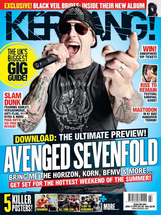 |
| Kerrang Magazine - June 2011 |
- What audience is the magazine aimed at?
The music
magazine, Kerrang is usually aimed
at a teenage audience; however older people with a passion for this type of
music, generally consisting of rock, punk and metal, might be interested in
buying this magazine each week. The age probably ranges from around 14 to 30
years old. The predominant gender would be, of course, men, considering the
magazine has a masculine feel toward its buyer. The cover artist on the
magazine has a very dominating pose about him; he draws in the reader because
he seems outgoing and full of energy, yet also delivers a sense of enigma; the
reader wants to find out more about him because of the aura he creates. More
aspects are the main-sell line as well as the sell-lines and how they talk
about the main festivals of the year which include Download Festival as well as Sonisphere.
These types of festivals would definitely not attract the likes of people who
have a passion for pop and mainstream music; these festivals are geared toward
lovers of heavy music which is exactly who Kerrang aim to please.
- What potential meanings do you think might
be encoded?
The possible
meanings which the magazine may want to deliver to the buyer are their overall opinion
on the heavy music scene of that specific year. The special codes which have
been used for this are the main-sell lines; snappy and short as well as bold
and bright. The reader can already see that the band, Avenged Sevenfold will be the main feature of Kerrang that week.
However, I could consider the fact that the cover artist, who is in the band himself,
could also predominately attract the reader first of all due to his ‘loud’ yet
inviting character. Another aspect which Kerrang want to give to their reader
is the fact that they have the “biggest
UK gig guide” therefore if their readers want to have a thorough list of
upcoming music events, they know that Kerrang will deliver. Kerrang have used a
subtle colour scheme to make this part of the magazine stand out. The colour
yellow against a light blue background may not sound very appealing, but
Kerrang have kept their colours very basic therefore their overall look is very
professional.
- How does the overall combination of codes
result in the sense of the magazine’s outlook?
On a whole, this
specific issue of Kerrang along with the great combination of codes results in
a very professional outcome. The outlook of the magazine cover is somewhat
simple, due to the fact that the colour scheme is basic; four main colours of
blue, yellow, red and black are used for this issue. This doesn’t create a
boring outlook; this gives a sense of invitation. Kerrang, as an overall
magazine, subtly make themselves stand out. The most dominating code of Kerrang
usually is their main image, and in this issue, although the artist’s clothes
fit in with the colour scheme, his body language almost makes us think that he
can jump out of the magazine. Kerrang’s house
style gives an optimistic outlook on how they portray life in the music
industry, especially with their language use. They use bold words such as “terror” and “killer” which may seem very harsh to some people, but in this
sense, these words are inviting to the fans of this type of music. Kerrang
offer a loud and heavy taste of the music industry, something completely
different from the likes of perhaps, NME
or Q magazine.
Subscribe to:
Comments (Atom)