The music
magazine, Kerrang is usually aimed
at a teenage audience; however older people with a passion for this type of
music, generally consisting of rock, punk and metal, might be interested in
buying this magazine each week. The age probably ranges from around 14 to 30
years old. The predominant gender would be, of course, men, considering the
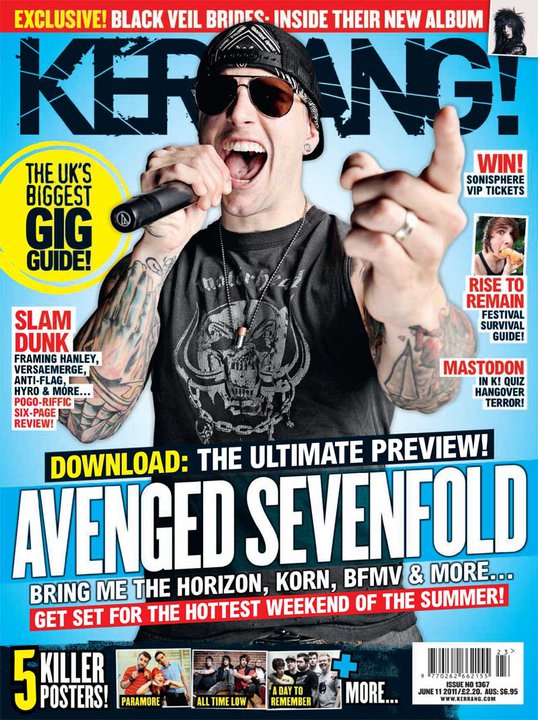
magazine has a masculine feel toward its buyer. The cover artist on the
magazine has a very dominating pose about him; he draws in the reader because
he seems outgoing and full of energy, yet also delivers a sense of enigma; the
reader wants to find out more about him because of the aura he creates. More
aspects are the main-sell line as well as the sell-lines and how they talk
about the main festivals of the year which include Download Festival as well as Sonisphere.
These types of festivals would definitely not attract the likes of people who
have a passion for pop and mainstream music; these festivals are geared toward
lovers of heavy music which is exactly who Kerrang aim to please.
What potential meanings do you think might
be encoded?
The possible
meanings which the magazine may want to deliver to the buyer are their overall opinion
on the heavy music scene of that specific year. The special codes which have
been used for this are the main-sell lines; snappy and short as well as bold
and bright. The reader can already see that the band, Avenged Sevenfold will be the main feature of Kerrang that week.
However, I could consider the fact that the cover artist, who is in the band himself,
could also predominately attract the reader first of all due to his ‘loud’ yet
inviting character. Another aspect which Kerrang want to give to their reader
is the fact that they have the “biggest
UK gig guide” therefore if their readers want to have a thorough list of
upcoming music events, they know that Kerrang will deliver. Kerrang have used a
subtle colour scheme to make this part of the magazine stand out. The colour
yellow against a light blue background may not sound very appealing, but
Kerrang have kept their colours very basic therefore their overall look is very
professional.
How does the overall combination of codes
result in the sense of the magazine’s outlook?
On a whole, this
specific issue of Kerrang along with the great combination of codes results in
a very professional outcome. The outlook of the magazine cover is somewhat
simple, due to the fact that the colour scheme is basic; four main colours of
blue, yellow, red and black are used for this issue. This doesn’t create a
boring outlook; this gives a sense of invitation. Kerrang, as an overall
magazine, subtly make themselves stand out. The most dominating code of Kerrang
usually is their main image, and in this issue, although the artist’s clothes
fit in with the colour scheme, his body language almost makes us think that he
can jump out of the magazine. Kerrang’s house
style gives an optimistic outlook on how they portray life in the music
industry, especially with their language use. They use bold words such as “terror” and “killer” which may seem very harsh to some people, but in this
sense, these words are inviting to the fans of this type of music. Kerrang
offer a loud and heavy taste of the music industry, something completely
different from the likes of perhaps, NME
or Q magazine.
No comments:
Post a Comment