Thursday, 31 January 2013

Further Corrections on Contents Page


In this session, I have firstly added an image to the main feature of my contents page, which is the part of the main cover model. This image was taken with my own equipment, and I chose to have the white wall behind so the model stood out, especially with her outfit and the way the hair is blowing. I made the quote from her below stand out from the image, with editing on the outline and colour.
I also changed the background of the competition page to a deep orange, so it really contrasted well with the rest of the page, and added two images together of some of the band, Linkin Park, who are featured within this particular part.
I decided to also change the numbers into a red tone, so they stood out against the jet black of the features in the magazine themselves.

Thursday, 24 January 2013

Simple Outline of Contents Page


For now, this is where I am going to place my features on my contents page. I tested out different areas in which I should place them as such, and this is my outline so far. At the top, I have added the Editor's Note, which is the same as my contents page rationale. I plan to keep the colours minimal, as  this ties in with the theme of my magazine's front cover with its retro twist.

On the bottom, I have created a 'Concerts and Competitions' feature, which probably would be featured in every month of the issue. I have made this tie in with Linkin Park's feature on my front cover, and have used my own images from both a Linkin Park concert as well as a trip to Paris.

I intend to gather more images of the cover model, as on the right, she will be have a rather big feature as she and her band are the main one. I have added a quote for added professionalism and the general feel of it being more like a realistic magazine.

TIME MANAGEMENT

From now, I am aware that my overall product needs to be finished in a few months, hopefully by the end of April. So, with this in mind, I now know how much time I have to do this product, and on a whole, I think that's achievable because I've now began my contents page.

Wednesday, 23 January 2013

Inspirational Contents Pages


Not really knowing where to head with the layout of my contents page, I have researched four similar ones from music magazines, NME, Q and Kerrang. What is most appealing in my opinion, is the fact that there's a huge photograph on them all to hint at the main article/band/artist in the particular issue.
Another element which is most appealing is the editor's note in the top left-hand corner of Kerrang's contents page, with an image of the issue's front cover. I find that this subliminally makes the whole contents page tie in with the front cover; it's obviously meant to be a follow on, and I find that it's a great way of making the whole magazine come together.
I also really like the simplistic order of the main contents on the sides of the issues; their colour palettes are simple, but bold, meaning they stand out and are attractive to read as they aren't too overly powerful.

Contents Page and Rationale


For now, I am going to move on to my contents page, where I have done a rationale featured above. Although there isn't a lot of depth and detail added to this particular rationale, I find that it's because I will gather more ideas along the way when creating this page for my magazine. First of all, I plan to have the Editor's Note in the top right-hand corner of the page, so it seems out of the way from my main features, but at the same time, I shall draw attention to it with an eye-catching word like "Hi!" for example, drawing in the attention of the reader. At this moment, I am drawn between having an editor's photograph in the left-hand corner or simply, like Kerrang, have the front cover of my magazine featured. I shall see which one goes better with my overall layout.

For my main feature in the magazine, which is the fictional rock star, Ellie Rose, featured on my front cover, I plan to make this either in the middle of the page or to the right, depending on which looks more professional and what will draw the reader's attention more thoroughly. To the left-hand side of this, I shall have my main contents area, telling the reader what shall be featured in my magazine. I intend to keep this black, and perhaps make some of the important features bold so they stand out.

I probably won't use the star effects now that I have taken the look of a retro theme for my overall magazine, but I may still use the features, like the competition for my reader's entertainment. The red background stands out against the rest of the page, and I thought that it gave it a finished look of professionalism without looking too over the top, and keeping the same colour scheme as my front cover.

Lastly, I still really like the idea of having a film-reel of three photographs for my magazine, as this again, ties in with the vintage feel I want to portray, so the Polaroid effect should give off a great similarity. On the bottom right-hand side too, I have added where my magazine can be located on the three most popular social networks of today; Facebook, Twitter and Instagram, and I have came up with a fictional 'go-to' site for each.


Thursday, 17 January 2013

Further Inspiration


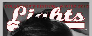
The famous Rolling Stone magazine covers have always caught my eye, purely because there are minimal aspects that are featured, in the magazine, shown, which gives it a simplistic and original look. As you can see, I've print-screened both the famous version of Adele featured, near my own magazine cover. This particular magazine cover really inspired me to create something quite similar, but obviously intended for my audience and with my own personal taste included.

It's obvious that both covers have very similar aspects; this cover was my main inspiration after all. I also realised that the left-hand side of the cover has been left blank, which - for now perhaps - I have decided to use as well, as I found that it gave the magazine a fresh and professional look, without looking too overloaded with features.

Thursday, 10 January 2013

Corrections on Front Cover


Taking my peer assessment from the class, I have  firstly made the masthead a lot bigger so it fits the whole width of the page, and through this I find that it looks a lot more like a professional-looking front cover. I haven't changed any font or colour however; I plan to keep this retro theme. Secondly, I moved the price of the magazine to just below the masthead, as in most magazines they are usually subtle, so I wanted that same effect, and with this it wouldn't draw attention from the rest of the magazine features. For the 'Collector's Edition' part, I moved it above the masthead, and kept the colour standing out against the latter, and made the font a lot bigger so the reader would know that this particular edition of my magazine is one to keep.


For one of my headlines, I decided to change most of the band names which I added on to the right-hand side of my magazine, and swap them over to the left-hand side instead. I done so because this particular headline  needed quite a lot of space, and with adding the names of the bands featured within my magazine just over the cover model's hand and a small part of her face, I haven't hidden any features of herself and I have made this aspect of the cover stand out as much as possible. I done this by adding the font, 'Copperplate' from dafont.com and with using two relevant colours of red and white, I was able to create a significant theme which ties in with my overall colour scheme. Plus, I made sure that they were all aligned with one another; this made the outcome of the headline more effective and professional.


One of the last changes I made for now, was adding a black outline on the main-sell line. I done so because, beforehand, I thought that it didn't really stand out a lot against the model's jacket, even though the colours were different. By adding the outline, I was able to make the main feature in the magazine look important, and it also draws attention to itself too. Below, I changed the comment to a snappy and short sentence of "Rock Star Status" from my original two sentences. I found that this should draw in the reader even more because it gives the cover model a sense of place and professionalism. Lastly, I moved the barcode to the bottom-left corner and made it a lot smaller, so it wouldn't stand out and look too harsh against everything else featured on the cover.